How a century old game can help you understand health information systems

About the author
Grégoire Lurton is Data Science Lead at Bluesquare. Before joining the team, he worked both in the field supporting national data systems for HIV responses in Africa, and in academic research at the Institute for Health Metrics and Evaluation at the University of Washington.
Working with routine Health Management Information Systems (HMIS) is a lot like solving a puzzle. You have to combine different activities, from data collection to analysis and reporting, to keep track of different subjects that go from vaccination or HIV care to infrastructure, human resources or logistics. We want to put those pieces together to get a useful perspective and information on results of health programs, challenges met, and to think about possible solutions.
Actors in those systems will include rural health workers, national decision-makers and international partners, who inevitably have different visions of what the HMIS should do and how it should be organized. It is therefore challenging to come up with solutions that provide good quality data on all needed dimensions to a host of different stakeholders.
One of the challenges is to understand each actor’s vision for how data should be collected and analyzed. I think we can compare those visions to three different ways of making an image. Are HMIS more like jigsaw puzzles, high definition pictures or like tangrams? Let’s discuss.
Monitoring & Evaluation: the jigsaw-puzzle approach

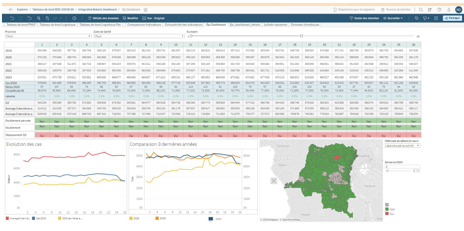
Monitoring & Evaluation (M&E) health programs are key consumers of the information generated by HMIS. They assess the performance of various health systems dimensions based on a list of key indicators. The guidelines for Global Aids monitoring are an excellent example. It gives countries precise guidance on what indicators should be defined, collected, analyzed and reported to monitor the fight against HIV.
In this variety of HMIS, each indicator measures an input, output or result, and their combination shows a complete picture of relevant program dimensions. This means that indicators definition is crucial. Those of you working in global health may have experienced these painstakingly long sessions where hubristic lists of indicators are discussed and negotiated, definitions are thoughtfully tailored and scrutinized to make sure they have all desirable characteristics.
I think of this approach as the jigsaw-puzzle, because of the way it models information: a precise set of pieces that can only be assembled in one way, to form one specific picture.
In Life: a User’s Manual, Georges Perec notes that “puzzling is not a solitary game: every move the puzzler makes, the puzzle-maker has made before”. For global health players, this is one of the virtues of the jigsaw-puzzle approach. It provides the ability to control program outcomes and to ensure that everything that counts (for donors) is measured.
However, this approach lacks flexibility. To get the exact picture desired, the pieces need to be cut and assembled accordingly. In HMIS terms, this translates into a high burden on data collection. The end result is very sensitive to data completeness (everybody hates having a missing piece) and data quality (what if one piece is not cut right?). And of course, there’s always the risk of assembling 1000 puzzle pieces to end up with a lot of blue sky.
Focus on primary data collection: the photoshop approach

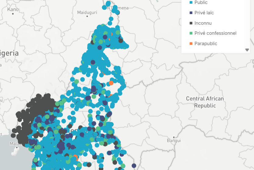
A second approach puts the data collection instrument at the heart of the HMIS. There’s no need to know the final picture from the start. Rather, we record every action in the health system and use it to measure our program’s results any way we want to.
I think of this approach as the photoshop approach. If I have a high quality picture, taken with a fancy camera, I should be able to crop out the least interesting parts, add some filters or maybe even combine pieces from different pictures to get an even more interesting image.
This is often chosen when using patient level Electronic Medical Record systems as a data source, combining it with the Electronic Logistical Monitoring Information System and a computerized Human Resource information system. A great advantage is that the data collection is a part of daily activities. Highly skilled professionals are then able to analyse the data, with its granularity offering them a lot of flexibility in creating the picture they want.
The drawback, however, is the mismatch between data that is needed for daily operations and data needed for reporting. For example, your pharmacist may be interested in tracking how many patients have an appointment next month, to plan for drug procurement, but your M&E specialist will be more interested in how many patients did actually come last month, so just to track the volume of activity you need two different types of dates for two people, and it only gets worse when you start to think about things like age groups. And, as you know, when it is easy to take pictures you will often take way too many. Likewise if the cost of adding a data field in a form is null, we often end up with a lot of data collected with no clear goal in mind. This is a burden for field workers who need to check additional boxes, and for analysts who need to sort through kilometric lists of data elements, like a trigger happy photographer coming back from holiday. Finally, the risk of relying on a complex technology is that it may be hard to use, and it may very well break.
Real world data integration: the tangram approach
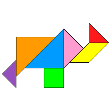
A lost model I encountered in my decade working in global health, and my favorite, is the Tangram model. Tangram is a game where a set of seven polygons can be assembled to make-up different identifiable shapes. The key points here are the simplicity of the pieces and their reusability. This approach to data systems is focused on the collection of simple data elements, which analysts integrate and rearrange to get the pictures we need.
We use a version of the tangram model in our work at Bluesquare when developing data integration projects. We identify pre-existing data sources, the simple geometric shapes of the health data ecosystem, combine their most relevant components to create models, analyses, and dashboards that answer a large number of questions. When working with a National Malaria Program for instance, we identify data that can be useful to reuse for Maternal and Child Health programs, or to integrate with the national surveillance system. The information is sometimes patchy, and some analyses may be out of reach, but the insights that come out frequently exceed the informational value of their component parts.
Tangram approaches have two main advantages. First, they offer a coherent approach in terms of work distribution in the HMIS. They make data collection as simple as possible for health workers, and give analysts and M&E specialists the key role of working on innovative ways to analyse data.
Second, they are robust to the frequent changes and evolutions of low-resource health systems. As priorities evolve, reporting frameworks are often rethought, new donors require new indicators or technical partners offer new approaches to measurement. With simple, important, but not overly specific indicators, data collection tools in facilities can be consolidated and easily understood by health workers. New users just need to reuse a combination of existing data, maybe adding a few new indicators.
Towards a more modular HMIS
While different approaches can work in different settings, we generally prefer tangram-like approaches when working with partners around the world. We believe that adapting information demands to use existing data collection plans, rather than asking health workers to bear the burden of evolving (and sometimes hubristic) data collection plans is a more effective way of building and strengthening an HMIS.
In this scope, data integration tools such as OpenHexa are key elements that enable HMIS professionals to make the best use of the various pieces of data they have at their disposal, combine them and assemble them in various ways.
Are you curious about how this can work in practice? Do you want to discuss how to mobilize your data to better understand your programs ? Don’t hesitate to reach out to me or our team to start a conversation!